CONTROLLED INPUT TEST · OCTOBER 11, 2026
Coloring Page Maker: Color or Grayscale Photo?
Try the original color photo first in this coloring page maker. Turning it black and white beforehand can remove a boundary that the tracer would otherwise detect. The final page is still black and white; the input colors help the tool decide where a line belongs.
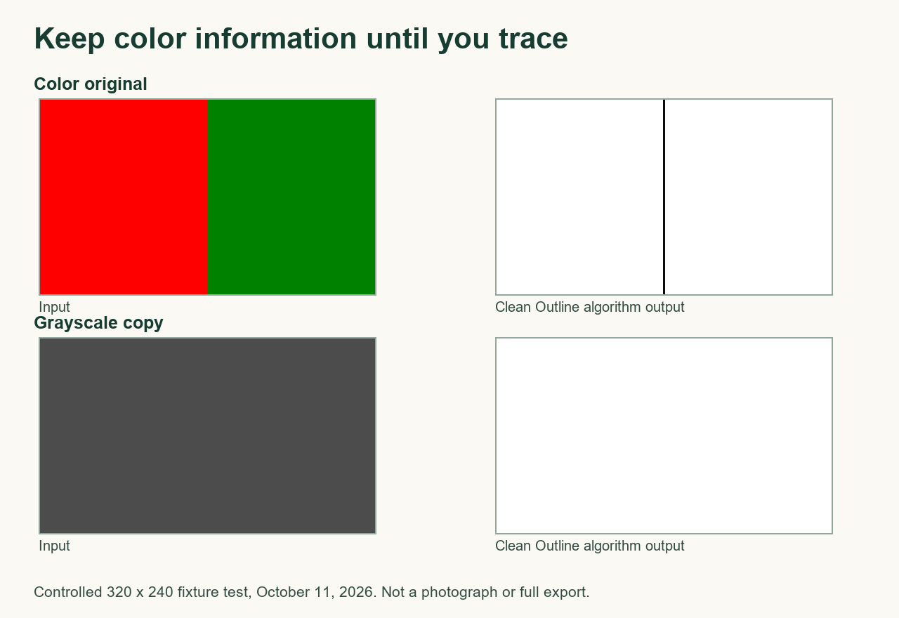
The boundary test: equal brightness is not equal information
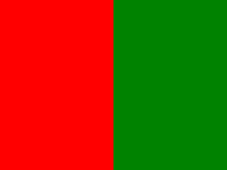
We made a 320 × 240-pixel image with a red left half, RGB (255, 0, 0), and a green right half, RGB (0, 130, 0). The current code calculates brightness as round(0.299R + 0.587G + 0.114B). Red gives round(76.245) = 76; green gives round(76.31) = 76. A second input replaced every pixel with RGB (76, 76, 76). Both inputs were opaque.
We extracted the unchanged blurGray and makeLineArt functions and the style presets from the public tool code, checked that the public file matched our local copy, and ran both inputs with Clean Outline on October 11, 2026. There was no photo decoding, resizing, paper layout, or export stage in this isolated test.
| Input | Pixels below gray 128 | Darkest gray value |
|---|---|---|
| Red / green original | 476 | 10 |
| Uniform grayscale copy | 0 | 255 |
The measured strip contains x = 156–163 and y = 1–238: 8 × 238 = 1,904 pixels around the center boundary. “Below 128” is our counting rule, not a visibility threshold promised for every printer. We excluded the outside pixel rows and counted the same area in both outputs.
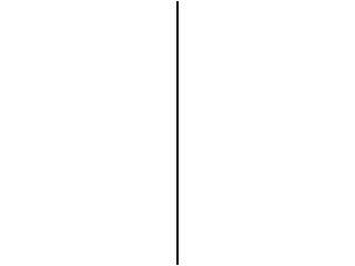
The original retained a dark dividing line. The grayscale copy had no internal contrast and returned a white strip. This demonstrates one lost boundary, not that every color photograph makes a better coloring sheet. Download the color fixture, grayscale fixture, and their color-input trace / grayscale-input trace to inspect the exact pixels.


Why color can survive in a black-and-white result
This implementation considers changes in individual red, green, and blue channels as well as changes in brightness. It uses the stronger of those signals before applying the selected style's thresholds. Removing color first discards that extra signal. A grayscale filter may also use a different brightness formula from our test, so its result need not match the uniform copy shown here.
A useful comparison for your own picture
- Keep the original file. Start with its color version and select one line style.
- If you want to compare a grayscale edit, use the same crop, pixel dimensions, and style. Changing several settings together makes the cause harder to judge.
- Look at the important boundary: a shirt against a wall, a toy against a table, or a pet against its background. Choose the version that keeps that boundary without filling the page with tiny marks.
- Inspect the finished page before printing. Neither color nor grayscale repairs missing detail in a blurred source.
Those examples are suggested inspection points, not tested photographs. The controlled result above does not predict performance on faces, fur, compression artifacts, or every colored background. If the original is already black and white, use it as it is; adding guessed colors is not necessary.
Watch the experiment
Watch the narrated color-versus-grayscale test, with English captions and a downloadable video.
Related checks and sources
For a general explanation, read how this tool traces edges. For a different source problem, see why export DPI does not fix blur or the matched brightness test.
Method source: the current public tool code and the four downloadable fixture files above. Benchmark pages checked October 11, 2026, in order: Mimi Panda, iColoring, and Canva. We did not find this equal-brightness controlled comparison in the inspected tool-page text. This is not a claim about their complete sites or private algorithms.